웹 사이트를 구성할 때 텍스트 영역은 매우 중요합니다. 텍스트 영역은 사용자가 사이트에서 읽을 수 있는 모든 텍스트를 포함하는 영역을 말합니다. 주요 텍스트 영역은 다음과 같습니다.
헤더(Header): 사이트 상단에 위치한 영역으로 로고, 메뉴, 제목 등의 텍스트를 담습니다.
푸터(Footer): 사이트 하단에 위치한 영역으로 저작권 정보, 연락처 등의 텍스트를 담습니다.
본문(Content): 헤더와 푸터 사이에 위치한 중요한 텍스트 영역으로, 사이트의 핵심 정보를 담습니다.
사이드바(Sidebar): 주요 본문 영역 옆에 위치한 영역으로, 부가적인 정보나 링크 등을 담습니다.
모달창(Modals): 페이지 내에서 팝업 형태로 떠오르는 작은 창으로, 주로 사용자에게 추가 정보나 알림을 제공하기 위해 사용됩니다.
이러한 텍스트 영역은 HTML과 CSS를 사용하여 디자인되고, 자바스크립트를 사용하여 인터랙티브한 기능을 추가할 수 있습니다. 예를 들어, 자바스크립트를 사용하여 텍스트가 나타나고 사라지는 애니메이션 효과를 적용하거나, 사용자가 스크롤링할 때 자동으로 텍스트가 나타나는 등의 동적인 기능을 추가할 수 있습니다.
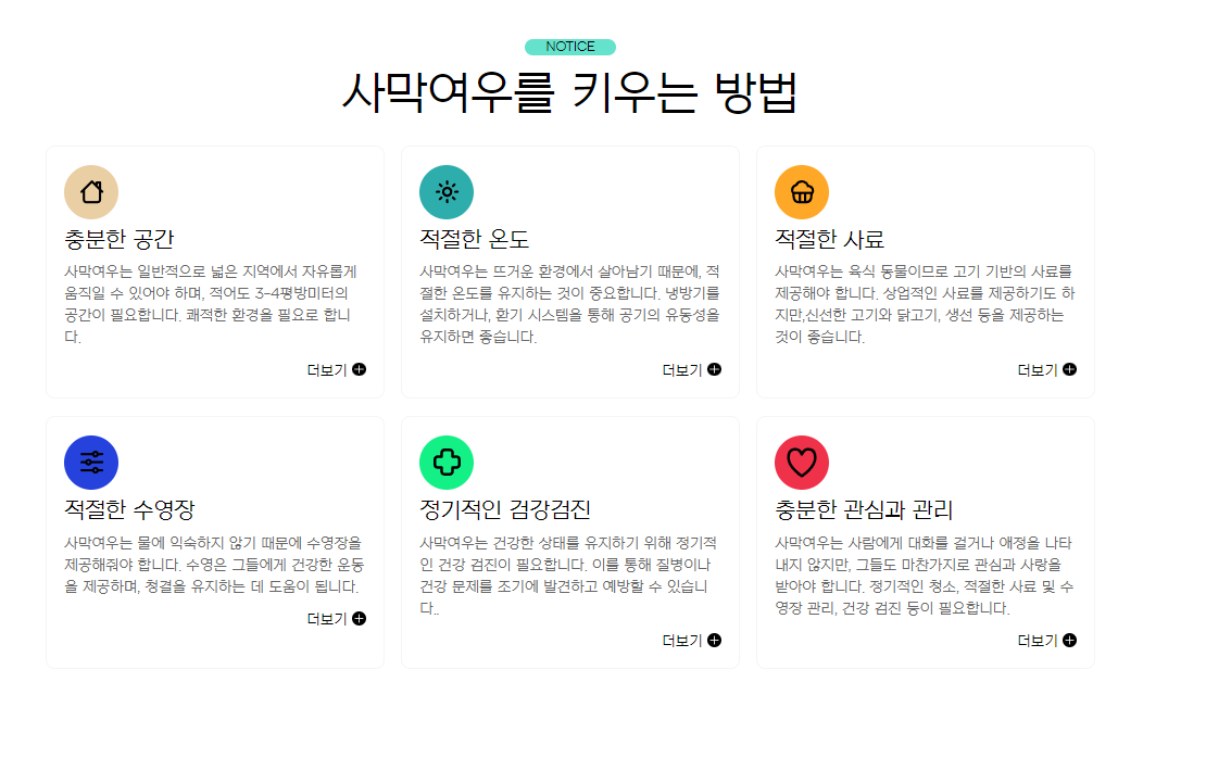
먼저 피그마를 이용하여 만들고 싶은 사이트 이미지를 만들고 이 이미지를 토대로 코드를 적어 사이트를 만들어 보겠습니다.
먼저 html코드 입니다.
<!DOCTYPE html>
<html lang="ko">
<head>
    <meta charset="UTF-8">
    <meta http-equiv="X-UA-Compatible" content="IE=edge">
    <meta name="viewport" content="width=device-width, initial-scale=1.0">
    <title>텍스트 유형01</title>
    <link href="https://webfontworld.github.io/NexonLv1Gothic/NexonLv1Gothic.css" rel="stylesheet">
</head>
<body>
    <section class="text__wrap section center nexon">
        <div class="container">
            <span class="section__small">NOTICE</span>
            <h2 class="section__h2" mb70>사막여우를 키우는 방법</h2>
            <div class="text__inner">
                <div class="text t1">
                    <h3 class="text__title">충분한 공간</h3>
                    <p class="text__desc">사막여우는 일반적으로 넓은 지역에서 자유롭게 움직일 수 있어야 하며, 적어도 3-4평방미터의 공간이 필요합니다. 쾌적한 환경을 필요로 합니다.</p>
                    <a class="text__btn" href="#">더보기</a>
                </div>
                <div class="text t2">
                    <h3 class="text__title">적절한 온도</h3>
                    <p class="text__desc">사막여우는 뜨거운 환경에서 살아남기 때문에, 적절한 온도를 유지하는 것이 중요합니다. 냉방기를 설치하거나, 환기 시스템을 통해 공기의 유동성을 유지하면 좋습니다.</p>
                    <a class="text__btn" href="#">더보기</a>
                </div>
                <div class="text t3">
                    <h3 class="text__title">적절한 사료</h3>
                    <p class="text__desc">사막여우는 육식 동물이므로 고기 기반의 사료를제공해야 합니다. 상업적인 사료를 제공하기도 하지만,신선한 고기와 닭고기, 생선 등을 제공하는 것이 좋습니다.</p>
                    <a class="text__btn" href="#">더보기</a>
                </div>
                <div class="text t4">
                    <h3 class="text__title">적절한 수영장</h3>
                    <p class="text__desc">사막여우는 물에 익숙하지 않기 때문에 수영장을 제공해줘야 합니다. 수영은 그들에게 건강한 운동을 제공하며, 청결을 유지하는 데 도움이 됩니다.</p>
                    <a class="text__btn" href="#">더보기</a>
                </div>
                <div class="text t5">
                    <h3 class="text__title">정기적인 검강검진</h3>
                    <p class="text__desc">사막여우는 건강한 상태를 유지하기 위해 정기적인 건강 검진이 필요합니다. 이를 통해 질병이나 건강 문제를 조기에 발견하고 예방할 수 있습니다..</p>
                    <a class="text__btn" href="#">더보기</a>
                </div>
                <div class="text t6">
                    <h3 class="text__title">충분한 관심과 관리</h3>
                    <p class="text__desc">사막여우는 사람에게 대화를 걸거나 애정을 나타내지 않지만, 그들도 마찬가지로 관심과 사랑을 받아야 합니다. 정기적인 청소, 적절한 사료 및 수영장 관리, 건강 검진 등이 필요합니다.</p>
                    <a class="text__btn" href="#">더보기</a>
                </div>
            </div>
        </div>
    </section>
</body>
</html>
<section> 태그는 웹 페이지를 논리적인 섹션으로 나눌 때 사용합니다. section 태그의 이름은 text__wrap이라는 클래스 이름으로 지정하였습니다.
section 태그 밑으로 <div class="container">를 만들어
<div class="text__inner">를 감싸주었습니다.
text__inner 의 자식으로 t1,t2,t3,t4,t5,t6의 div태그를 만들어 text 내용을 적어 주었습니다.
a href='#' 태그는 나중에 링크를 연결하여 다른 페이지로 넘어가기 위해 남겨주었습니다.
style 코드입니다.
<style>
    /* reset */
    * {
        margin: 0;
        padding: 0;
    }
    a {
        text-decoration: none;
        color: #000;
    }
    h1,h2,h3,h4,h5,h6 {
        font-weight: normal;
    }
    img {
        vertical-align: top;
    }

    .mt10 {margin-top: 10px !important;}
    .mt20 {margin-top: 20px !important;}
    .mt30 {margin-top: 30px !important;}
    .mt40 {margin-top: 40px !important;}
    .mt50 {margin-top: 50px !important;}
    .mt60 {margin-top: 60px !important;}
    .mt70 {margin-top: 70px !important;}


    .mb10 {margin-bottom: 10px !important;}
    .mb20 {margin-bottom: 20px !important;}
    .mb30 {margin-bottom: 30px !important;}
    .mb40 {margin-bottom: 40px !important;}
    .mb50 {margin-bottom: 50px !important;}
    .mb60 {margin-bottom: 60px !important;}
    .mb70 {margin-bottom: 70px !important;}


    /* common */
    .container {
        width: 1160px;
        margin: 0 auto;
        padding: 0 20px;
        /* background-color: rgba(0, 0, 0, 0.1); */
    }
    .nexon {
        font-family: 'NexonLv1Gothic';
        font-weight: 400;
    }
    .section {
        padding: 120px 0;
    }
    .section.center {
        text-align: center;
    }
    .section__small {
        background-color: rgba(12, 209, 174, 0.64);
        font-size: 14px;
        border-radius: 50px;
        color: black;
        text-transform: uppercase;
        margin-bottom: 20px;
        display: inline-block;
        padding: 1px 23px;
    }
    .section__h2 {
        font-size: 50px;
        font-weight: 400;
        margin-bottom: 30px;
        line-height: 1;
    }
    .section__desc {
        font-size: 22px;
        line-height: 1.5;
        color: #666666;
        margin-bottom: 70px;
        font-weight: 300;
    }
    /* text__wrap */
    .text__wrap {}
    .text__inner {
        text-align: left;
        display: flex;
        justify-content: space-between;
        flex-wrap: wrap;
    }
    .text__inner .text {
        width: 32.33333%;
        border: 1px solid #f5f5f5;
        border-radius: 10px;
        padding: 90px 20px 20px 20px;
        box-sizing: border-box;
        margin-bottom: 20px;
        transition: all 0.3s;
        cursor: pointer;
        position: relative;
    }
    .text__inner .text:hover {
        background-color: #f5f5f5;
    }
    .text__inner .text::before {
        content: '';
        width: 60px;
        height: 60px;
        background-color: #af2222;
        background-image: url(../asset/img/textType01_01.svg);
        background-position: center;
        background-repeat: no-repeat;
        position: absolute;
        left: 20px;
        top: 20px;
        border-radius: 50%;

    }
    .text__inner .text.t1::before {
        background-color: #EACEA4;
        background-image: url(../asset/img/textType01_01.svg);
    }
    .text__inner .text.t2::before {
        background-color: #2EADAD;
        background-image: url(../asset/img/textType01_02.svg);
    }
    .text__inner .text.t3::before {
        background-color: #FFA726;
        background-image: url(../asset/img/textType01_03.svg);
    }
    .text__inner .text.t4::before {
        background-color: #2542DC;
        background-image: url(../asset/img/textType01_04.svg);
    }
    .text__inner .text.t5::before {
        background-color: #12F086;
        background-image: url(../asset/img/textType01_05.svg);
    }
    .text__inner .text.t6::before {
        background-color: #EF324A;
        background-image: url(../asset/img/textType01_06.svg);
    }
    .text__title {
        font-size: 24px;
        margin-bottom: 10px;
    }
    .text__desc {
        font-size: 16px;
        color: #666;
        margin-bottom: 15px;
        line-height: 1.5;
    }
    .text__btn {
        float: right;
        position: relative;
        padding-right: 20px;
    }
    .text__btn::before {
        content: '';
        position: absolute;
        right: 0;
        top: 0;
        width: 15px;
        height: 15px;
        background-image: url(../asset/img/icon_plus.svg);
        transition: all 0.3s;
    }
    .text__btn:hover::before {
        transform: rotate(360deg);
    }
</style>
가끔씩 css가 이상하게 적용될 때가 있습니다. 저같은 경우 박스와 박스 사이가 간격이 벌어지지 않아서

f12를 눌러 developer tool을 확인해보니 사용자 에이전트 스타일시트의 dispaly: block이 적용되어 있어서 display: flex와
justify-content: space-between 속성이 적용되지 않는 문제가 있었습니다.
이를 해결하기 위해 구글링을 한 결과 reset css를 제대로 하지 않으면 발생하는 문제임을 확인 하였습니다.
reset 영역의 제 코드를 다른 분들과 비교해보니 저는 img 태그에 width: 100%를 제거하지 않았었습니다.
User agent stylesheet은, 사용자가 명시해두어야 할 속성을 override 해주지 않거나, <!DOCTYPE html> 등으로 html 파일에서 html의 최신 버전을 알려주지 않아 브라우저가 임의로 설정해둔 것으로, 한마디로 각 브라우저마다 정해놓은 CSS의 기본 규칙 이라고 생각하면 됩니다.
reset css를 통해 디자인을 초기화시키고 개발하는 습관을 가지면 이러한 문제에 직면하지는 않을 것입니다.
common 영역은 다른 페이지를 제작할때도 공통으로 사용하는 부분입니다.
🤞css 속성 다시 알아보기
position: relative :이 속성을 적용하면 해당 요소의 위치가 문서 흐름에서 원래 위치를 기준으로 상대적으로 이동합니다.
vertical-align: top : 인라인 요소 (inline element)나 테이블 셀 (table cell) 등의 수직 정렬 방식을 지정하는 데 사용됩니다. 이 속성을 적용하면 요소가 상위 요소의 맨 위쪽에 위치하도록 정렬됩니다.
display: inline-block : 요소를 인라인 레벨 요소와 블록 레벨 요소의 특성을 모두 가지게 만드는 데 사용됩니다.
flex-wrap: wrap : flex 컨테이너 (flex container)의 플렉스 아이템 (flex item)들이 한 줄에 모두 표시되지 않을 경우, 다음 줄로 넘어가도록 지정하는 데 사용됩니다.
background-repeat: no-repeat : 배경 이미지의 반복을 금지하는 데 사용됩니다. 이 속성을 사용하면 배경 이미지가 한 번만 표시되고, 반복되지 않습니다.
position: absolute : 요소의 위치를 문서 흐름에서 상위 요소를 기준으로 절대적으로 지정하는 데 사용됩니다. 이 속성을 사용하면 해당 요소가 위치한 가장 가까운 상위 요소를 기준으로 위치를 지정하며, 문서 흐름에서 위치를 이동시킬 수 있습니다.
transform: rotate(360deg) : 요소를 360도 회전시키는 데 사용됩니다. 이 속성은 2D 변환을 다루는데, 해당 요소를 회전시키는 데 사용됩니다.